Times, when WordPress was just a blogging system, has ended. Now you can find many plugins that extend the capabilities of this platform with completely new features. One of such plugins is WPBakery Page Builder (formerly Visual Composer). After a long time of working with it, I want to share with you some advanced techniques.

Advanced tricks in Visual Composer – for who?
Visual Composer despite its undoubted advantages also has one big issue, which is difficult to master by less “technical” users. To learn the capabilities of this plugin in a good degree you have to dig through a ton of options which for some people may just be impossible.
There is also another group of users who have learned Visual Composer very well but some questions still remain unanswered. This guide is for such people and it won’t teach you the basics but I will focus on some limitations, which are not well described in the official documentation.
We have used those tricks with success to create Designs for our Rife Theme in past before we have switched to Elementor Page Builder.
1. How to hide a ROW in Visual Composer for mobile?
Hannah asked this question on our support forum:
I’m trying to hide a row on mobile view but can only find the option to hide columns. Is it possible to hide a full row?
It is a header row with an image set to full width in the background, but this image is not resizing on mobile so I’m getting a really weird crop.
My solution was to hide the row and add another image which is only visible on mobile, but open to other ideas if you have any.
In short: She wanted to create two versions of one similar ROW and hide one version on a desktop and second on a mobile. (Maybe that was not the exact question, but I just assumed that it had to be 😉 )
Yes, there is no such option in the Visual Composer, I had to find the solution.
After a few minutes of investigation, I decided to use only columns to simulate hiding things on different resolutions.
Let’s dive into solution!
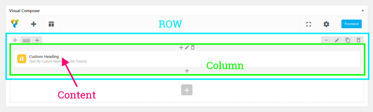
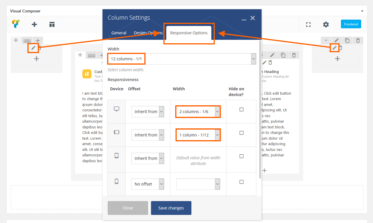
1.1 ROW without settings
Create a ROW and don’t add any settings to it like backgrounds, paddings or margins because this ROW will work only as a container for columns, columns with different settings.
Add your content to a first column. In my case, I added the Custom Heading.
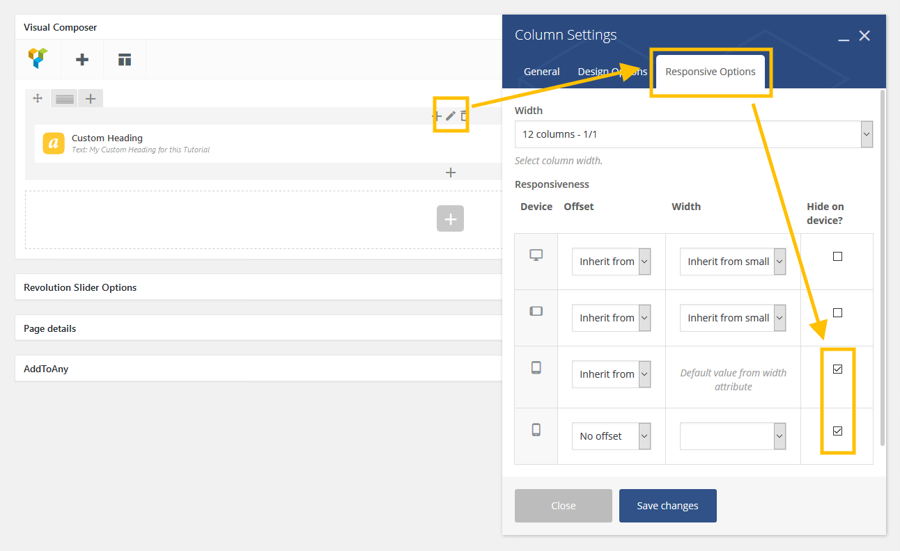
1.2 The First Column on desktop
Now you need to edit the first column. Go to the settings, add your background, paddings and finally go to the responsive tab:
1.3 The Second Column on mobile
Click on the + icons and create the second column in the same ROW:
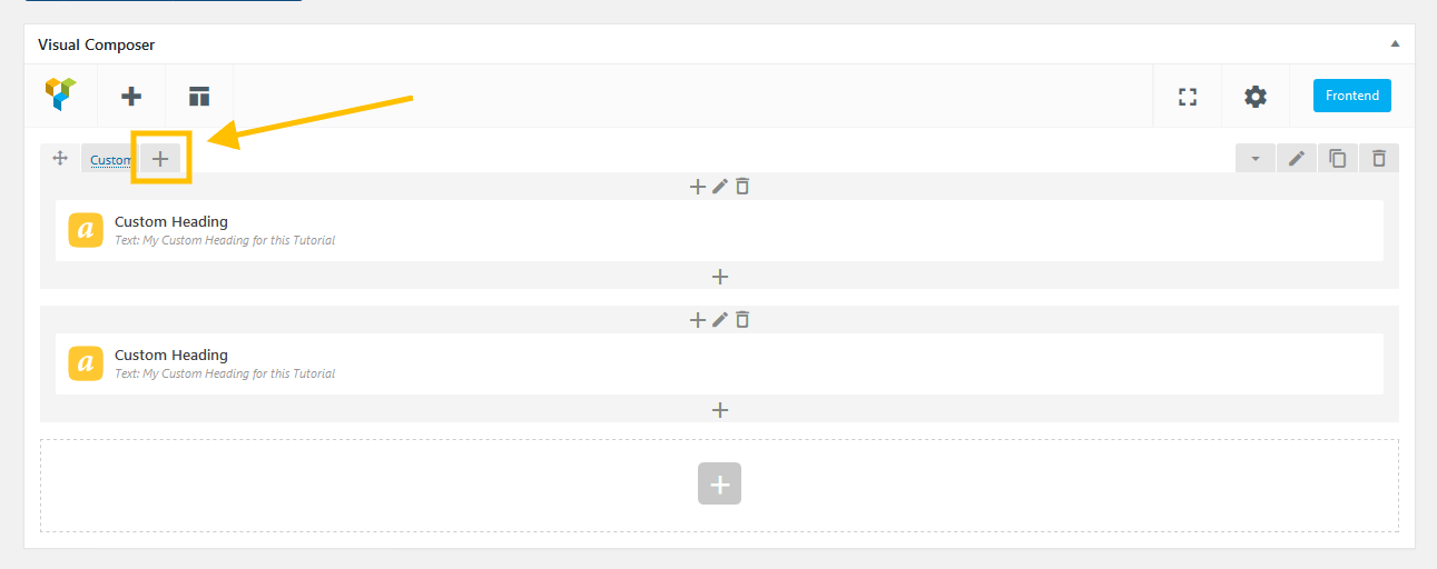
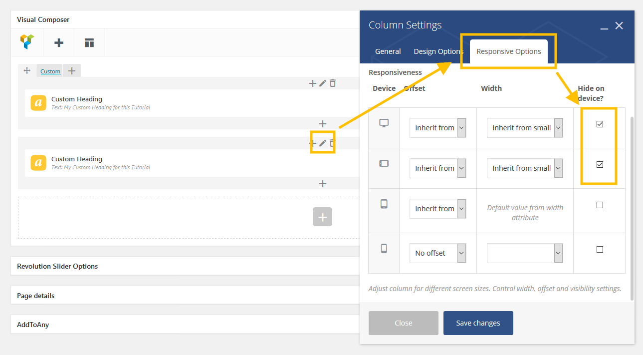
1.4 The Second Column with different content or settings
Now it’s time to decide what we want to show on mobiles. First of all, go to the responsive settings and mark the first two checkboxes (it will hide this column on a desktop).
What can you do now?
- You can add different content for a mobile column or just content with different settings like smaller font size or color.
- You can add different settings for a mobile column like a background, margins, paddings and borders.
With these options, you have bigger control on your content in a mobile and desktop resolutions.
2. ROW Layouts in Visual Composer – more control over different widths
After years of working on themes and helping our clients, I have come to the conclusion that I need more control over the columns.
Let’s face the truth – ROW layouts sucks! Yes, the default ones and yes, you can do it right but you must dive into custom layouts and make it from scratch. Let’s begin.

2.1 Choose default layout and change responsive options
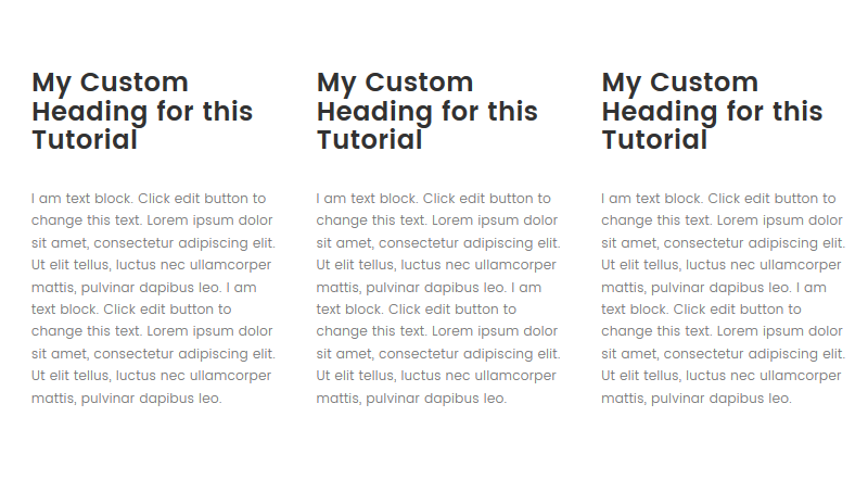
In my example, I used a more complex example. Let’s start with the default (1/4 + 4/6 + 1/6) layout. I added content only to the middle column (4/6) and both other columns were only to simulate nice margins.

On high resolution, it looked pretty nice, but unfortunately, on the lower resolution it was not so good:

2.2 Remember! Start from 1/1 width and change only the Responsiveness sizes
This is the most important part because you need to change the approach to creating columns. Always start by changing the width of the column to 100% and then go to the Responsiveness widths.
Take a look on the screen below. You have to edit two external columns and give them the same responsive settings.
Next, go to the Responsive Options of the middle column and these settings:
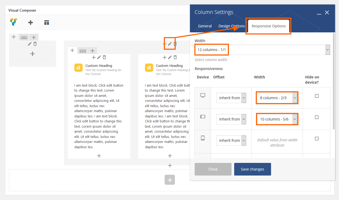
Now your content should look much better on lower resolutions.
In these examples, I wanted to show you that it is worth experimenting and looking for alternative ways to solve some of the Visual Composer limitations.
This is it for now with advanced tricks in Visual Composer. See you soon! 🙂
Hi, Daniel!
Do you know how to do the Row Trick in Visual composer – when row demonstrate with as 1/1+1/1 ?
the sample I found in The7 demo site here http://the7.io/product/ – there are rows with gray background
I cant get this result in an ordinary way, just typing 1/1+1/1 in the Custom field of row width
Hello Mike
In this specific case the authors of the 7 theme made a special style for this example. I tried to reproduce this layout but i used only the setting you can find in the standard Visual Composer. Check my example: http://rifetheme.com/rife/test/
You can see how it looks in the backend: http://nimb.ws/jOpRw4
With Regards
Daniel
Muy útil, gracias!
Hello, I’ve found your interesting guide on google. Maybe you can help me with one problem: I’m trying to edit some rows and columns for the responsive layout.
I have a row with 2 columns. In each column I have 2 another columns – inside these ones I made an image on the left and a text on the right. After that it looks like a business card with a team member image and some contact information.
This is my layout: https://ibb.co/g1TO96
The mobile version on 320px looks ok, the images are on the top and the texts are under the image. But the texts are still under the images, if I have more space on the right. https://ibb.co/eaf396
How can I tell this column that he should use the full width with image and text next to each other?
Greetings
Susann
Hello Susan
It’s hard to say in 100% because I don’t see a live website but you can try start to edit these two columns: http://nimb.ws/GUpPX2 . Add these settings to the first column on the left: http://nimb.ws/YKsLPX . Add almost the same values to the column on the right but change 1/3 to 2/3 in the desktop view.
With Regards
Daniel
Hello,
thank you so much for your answer. I was trying to set up the columns and the first and second box with the team member and the contact information looks almost correct if I take a look on 480px.
On 320px it’s wrong. I want the images full width and the text under the image like the third box.
If you like you can take a look here: http://me-le-immobilien.de/kontakt/
I still need more practise to understand the grid system.
Here’s another way I often use to hide full sections of content – in the ‘Extra class name’ section at the bottom of each element’s settings you can specify it’s visibility with:
vc_hidden-lg
vc_hidden-md
vc_hidden-sm
vc_hidden-xs
The beauty of this is the lack of planning; just pop it in while you’re playing with the layout at any stage.
Barry, you just saved my life with this comment. Thank you very much! I was looking for a way to hide the rows (using Kalium theme there is no direct option in the settings) and was going crazy, because I couldn’t find a good solution. Thank you thank you thank you!! 🙂
Best wishes from Germany,
Bianca
Wow!
Thank you, you are a mester
Guys I need your help
I am trying to divide my a row to 5 columns, 2 columns will be half of the quarter on the right and left sides and the other 3 in the middle as quarters.
what is the formula i should enter or how can i do that?
1/8 + 1/4 + 1/4 + 1/4 + 1/8
Enter the above into custom layout
This did not work for me. It will not accept this format. Why will it not let me do this?
Hi, how can I set the same row dimension on both the desktop and ipad?
the problem is that the background photo shrinks, while I would like it to remain the same as proportions. Can u help me?
Hi, I’m new to this and only been dealing with rows at the moment. Spacing either comes out ok or too much on laptop, but when I view it on mobile, everything is so close together. They don’t stack up, but they sure don’t have spaces. How do I make sure the spacing on laptop and mobile look the same? Thanks!
Regarding the column ordering, hiding columns on different screen sizes looks pretty lame. I hope that I can find something like Bootstrap 3 does (pull and push classes) or as an option from flexbox. Site Origin Page Builder already have column ordering on responsive option.
I agree with you in 100%. To be honest we decided to move our latest themes to the Elementor builder because the WP Bakery (aka Visual Composer) looks and works quite poor compared to other popular builders. Maybe you can find some nice shortcodes in the VC but the columns management is bad.
Hello Elisei. You can use Push/Pull classes within Visual Composer. They just don’t have any documentation for it. I wrote an article all about this at: https://studiok40.com/using-push-pull-classes-with-visual-composer/
I hope you find that useful.
Hey, great, great tips.
Do you know of a way to toggle the WP Bakery rows instead of having to the hide each one when doing page editing ?
You made my day! Thanks for the help!
Hello Daniel,
I am having trouble with six columns in responsive design. The columns are being displayed funky on a tablet. However, when it comes to a regular desktop or a smartphone device. The columns appear just fine. How do I fix the issue to where they are appearing as two columns side-by-side?
Hello Andrew
You should definitely contact with the official VC (WPBakery) support 🙂
Best Regards
Daniel
I am using visual composer on my site, the icon box element is not responsive on mobile/smartphone and breaks the text into non-readable text, like Re
ad
(means the word ‘Read’ look like the above I wrote) how to fix it?
regards
MJ
Please contact with the VC support. We do not provide support for this plugin.
Best Regards
Daniel
Thanks
Hi Daniel, thanks for the great tips! Do you have any that address the WPBakery vertical spacing differences between rows on different browsers?
Specifically the top spacing above the Video player element. or within tabs. If I master in Safari and tighten the space, it looks over tightened to the point of overlap on Firefox or Chrome. If I master using Chrome, the space is too big on Safari.
Any ideas? And what are your thoughts on Elementor vs Divi and how complicated is it to transfer over from WP Bakery to either?
Hope I’m not crowding you with too many questions.
Thanks,
James
Hello James and I’m glad you found these tips useful.
1) Let me know have you checked this problem with spacing on more than one theme? It may something happens that one theme can override the WPBakery CSS style.
If you see this problem on two or more themes, you should probably ask WPBakery support how they can handle it.
2) From my point of view, if you want to start something, you should start it with Elementor. We had some problems with WPBakery in the past and now I very skeptical about this plugin.
About transferring content from one builder to another. From what I know there is no easy way, and you should do it manually.
Maybe you can find a transfer plugin, but it can probably make a lot of mess 😉
With Regards
Daniel
Thanks so much for taking time to answer my questions Daniel. It is an older grid-based theme, so I’ll see if I can find anything in the theme options. Otherwise I haven’t had any major problems with WPBakery. And thanks for the tip on Elementor. I’ll give it a closer look.
Best regards,
James
Awesome post, great tips. Keep up the good work!
Useful tricks! Now I’ve got a question: how could I achieve this? [IMG]http://i68.tinypic.com/2hxondv.jpg[/IMG]
thank you
How possible is it to make everything on a row on Desktop View appear same on a Mobile view with Visual Composer, been giving me a hard time
To be honest, we don’t use WPBakery (aka old Visual Composer) anymore. It’s so frustrating to use it now. Please ask on the official WPBakery forum.
With regards, Daniel
Daniel,
This is exactly what I was looking for!!! I just published my live site, with some excellent graphics, (I think), that I worked really hard to create. Look great on desktop, but when it comes to mobile, they get lost and you can’t make out the details.
WPBakery does make a poor job at having good tutorials and explaining things as nicely as you did.
You opened up a whole other world of possibilities for me now. For example, at first, I got lost as to how you got the settings for 2 columns within the same row. Then I looked closely at your excellently illustrated example and realised I was pressing the wrong ‘+’ sign to create a 2nd column within the same row. I was just pressing the one beneath the 1st column.
Tada…I realised this big world of possibilities now! I just have to create other, more cropped and mobile-ready graphics for the ones that don’t look good on mobile!
I’m bookmarking you and thanks for this valuable knowledge once again!!!
Glad we could help 🙂 keep on rocking!
Hey quick question about hiding of rows and cols.
Do you know if this is similar to using CSS to hide elements or is it a function that talks to the server only showing the correct rows or cols depending on the devise and screen size?
The reason i ask is when you inspect a page in chrome it does show more than what is being viewed. Ie all mobile and desktop rows are rendered but some hidden? Is this correct or am i mistaken?
Thanks
I also find that simply using the Responsive Options Tab in VC that it does not totally hide the row, leaving a white area. The only way to hide completely is to use the extra classes for rows:
vc_hidden-lg
vc_hidden-md
vc_hidden-sm
vc_hidden-xs
Yes, it is only hidden by CSS, to not produce different source code dependant on the devices, as it would be bad for Search Engines.
The first solution worked great for me. Thank you so much! I can’t for the life of me understand how Betheme doesn’t have these type of useful instructions for responsive dev in their documentation nor in their support forums.
Either way, you saved my butt!
hi there…i think you are the right prof to solve my problem:
on my site i have a page with one row init 5 colums… if the horizontal size goes down to mobile ..aprox..470px all this 5 colums go one after one under them self to one colum… perfect…. but in all other sizes the colum shrink to ugly stripes …. is it possible with the responsive options to tell the row. on the first squees to do all 5 rows under them to one…like in the mobil resolution?
to change the mobile resolution to a higher range is not the goal. i only want this f….g row (sorry ;o) ) to change to ONE colum…
thanx for your help
best
claudio
THIS HELPED ME SOOOOO MUCH, THANK YOU!!!
Hi
I am wondering if anyone can guide on how to show to columns on mobile view using WPBakery Page Builder
Thank You